Why your website should be mobile friendly...
Google report that around 50% of all traffic to websites is now via mobile phones and tablets. Your website should provide all visitors, irrespective of device, with a simple and fast browsing experience.
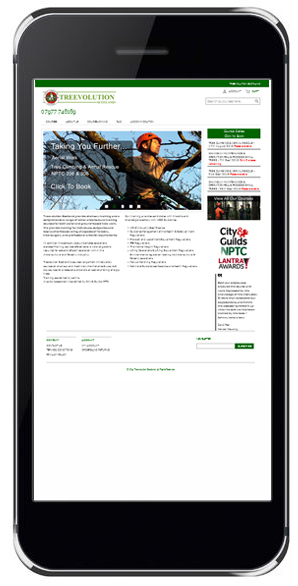
Viewing a website that hasn't been optimised for Mobile Devices on a mobile phone involves constant zooming and horizontal scrolling, leading to poor navigation and a frustrating and poor user experience. Many visitors to such sites leave them immediately.
If you think that it is not important that your site is mobile friendly, just perform this simple check. If you have Google analytics running on your site (and if you haven't you should) just look at the Bounce Rate. The Bounce Rate is the percentage of visitors who hit your landing page and leave without browsing further into your site. Compare the Bounce Rate for desktop and mobile visitors. If you find a significant discrepancy, you may want to think again.
We recommend using a responsive design which provides a fluid and flexible layout of content depending on device screen size and orientation. This means that you can have one version of your site content, and it will be displayed differently depending on the visitor's device. It is also possible to add, delete or have different portions of your content displayed, dependent on device. This allows you to vary positioning of content and emphasise key messages to suit screen size.
Call Jim now on 07977 746169 to discuss how we can help you.